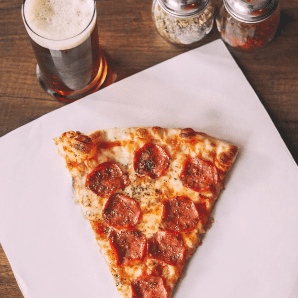
Krave Pizzeria

ELEVATOR PITCH

Where dough-licious starts

Serving krave-worthy moments, one savory pizza slice at a time.

Services Provided
Brand
Marketing
Web Design
Social
INDUSTRY
Hospitality
ABOUT THE PROJECT

This concept project reimagines what a local Clarkston, MI pizzeria could become through strategic rebranding.

The challenge we set was to create a brand that would resonate with younger demographics through playful, savory, and delightful touchpoints. The design balances vibrant Fiery Brick with ingredient-inspired colors to create an identity that feels both authentic and Instagram-worthy.

From the appetizing smiley-swoosh in the logo to the conversational voice in marketing materials, every element was crafted to feel approachable yet distinctive enough to stand out in a crowded market. The resulting visual system maintains enough flexibility to adapt across multiple locations while retaining its core personality.

This concept demonstrates how strategic branding can transform a local establishment into a scalable concept with national franchise potential, all while connecting authentically with Gen Z's desire for experiences that feel genuine, shareable, and slightly irreverent.

Brand Strategy

We developed the brand strategy centered on three core attributes: Playful, Savory, and Delighted. These qualities define the brand's personality, inform its conversational voice, and shape how customers feel during their experience - creating a consistent foundation for all brand expressions.

Brand Strategy

The Krave Pizzeria logo balances playful energy with modern sophistication. The prominent script lettering creates an inviting, handcrafted feel, while the bold san serif "PIZZERIA" grounds the identity with contemporary simplicity.

Most distinctive is the appetizing swoosh that extends atop of the logotype suggesting the act of savoring something delicious. This visual element communicates the sensory pleasure of the food while adding personality that sets Krave apart.
The logo's dynamic angle creates movement, suggesting the energetic experience customers can expect - a whimsical approach that remains approachable and memorable for the Clarkston community.

Visual Language

Krave Pizzeria's visual identity brings its playful, savory, and delighted attributes to life through an ingredient-inspired color palette. The vibrant Fiery Brick evokes brick ovens and tomato sauce, complemented by Wood-Fired Charcoal that references the perfect char on a crust. Mozzarella Pearl captures fresh cheese, while Basil green and Olive Oil Gold complete the authentic pizza ingredient story.
Typography balances personality with clarity - the playful Voltage script adds character, while clean Asterone ensures legibility. Together, these elements create a visual system that feels appetizing and approachable, perfectly capturing the brand's sensory appeal.

Website

Krave Pizzeria's digital home brings its playful brand to life through bold visuals and intuitive ordering. The mobile-first design balances personality with functionality, featuring cheeky copy, authentic photography, and seamless navigation. Interactive elements and social integration create an online experience that's as satisfying as the pizza itself—making the journey from craving to first bite effortless.
The website also ties in brand elements like the dripping cheese into various elements like buttons. Various line textures add personality and helps create hiearchy throughout the page, making it visually pleasing but also easier to read.

Looking for a creative partner?

Reach out to us for a intro call to see if we're the right fit to help with branding or website design and development.